LDI ブランディングデザイン | 一般社団法人ライフデータイニシアティブ
LDI
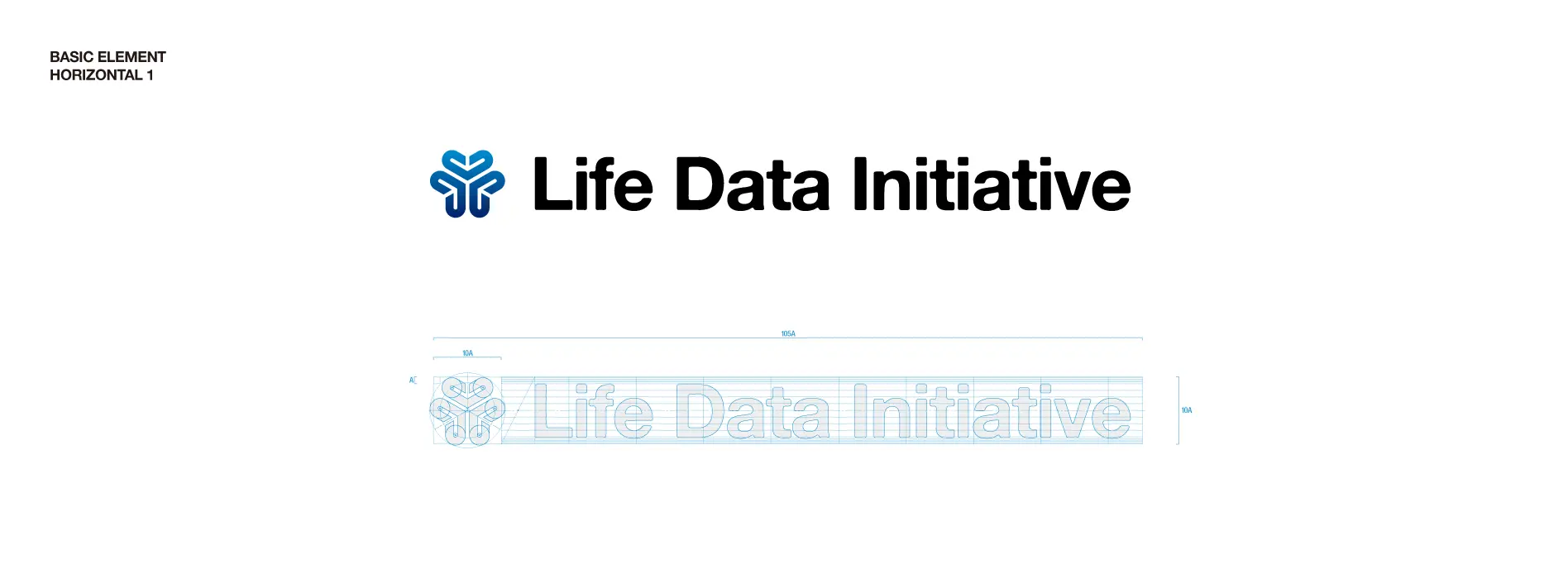
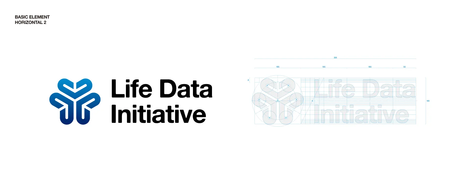
Life Data Initiative Branding
Design Consulting, Branding, Art direction, Graphic design
Art Director: Shimizu Ryo
Cl: Life Data Initiative
Graphis Design Annual 2021を受賞!
1944年から続く歴史を持つスイス発祥のデザイン誌(現在はNY, USA)、Graphisによるグラフィックデザインにおける国際コンペにて「Silver」を受賞しました。
選出された作品は、ウェブサイトにアーカイブされ、毎年上製本として世界中で出版されています。
LDIブランディングデザイン掲載のGraphis アーカイブはこちら
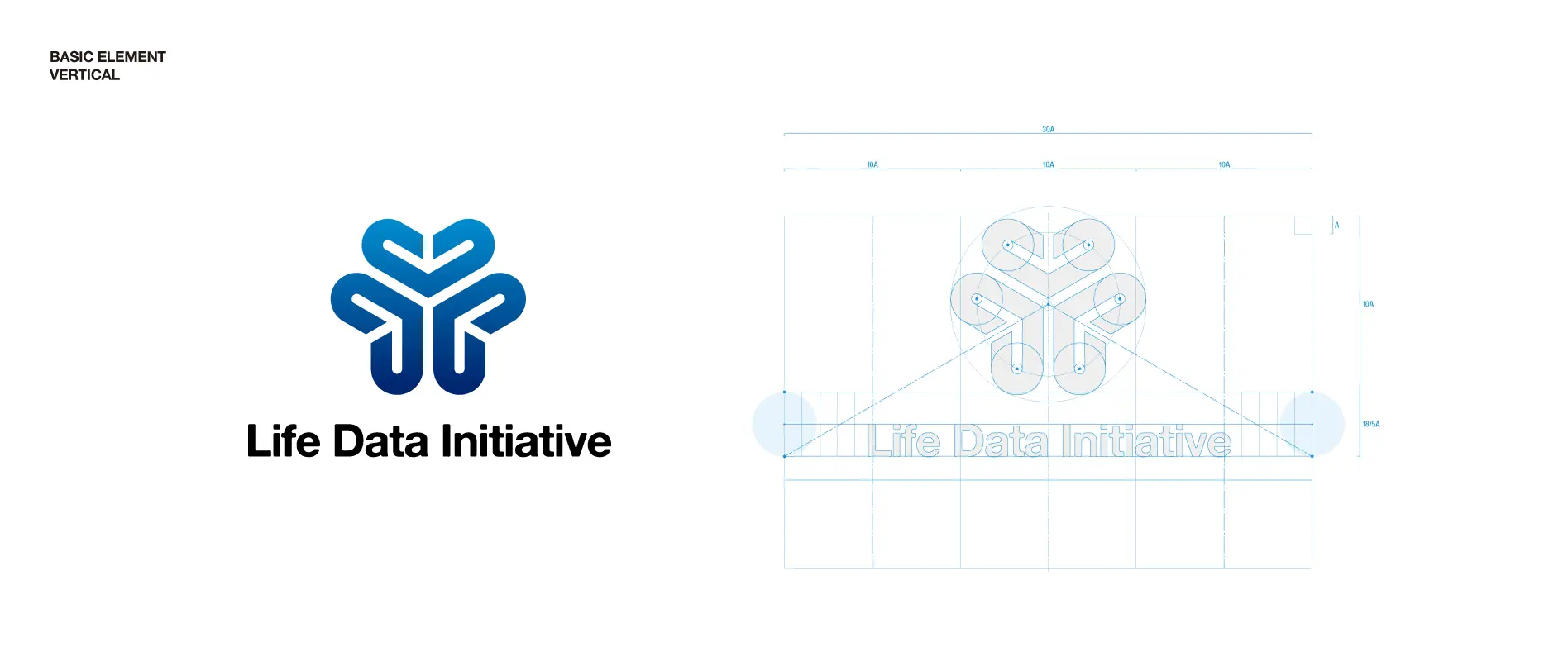
3つの「LIFE」を体現するコーポレート・アイデンティティ開発
医療分野の研究開発に資するための匿名加工医療情報を収集し、次世代の医療開発を行うスタートアップのコーポレート・アイデンティティ開発を行いました。
We collected anonymously processed medical information to inform research and development in the medical field and developed a corporate identity for a startup developing the next generation of healthcare.
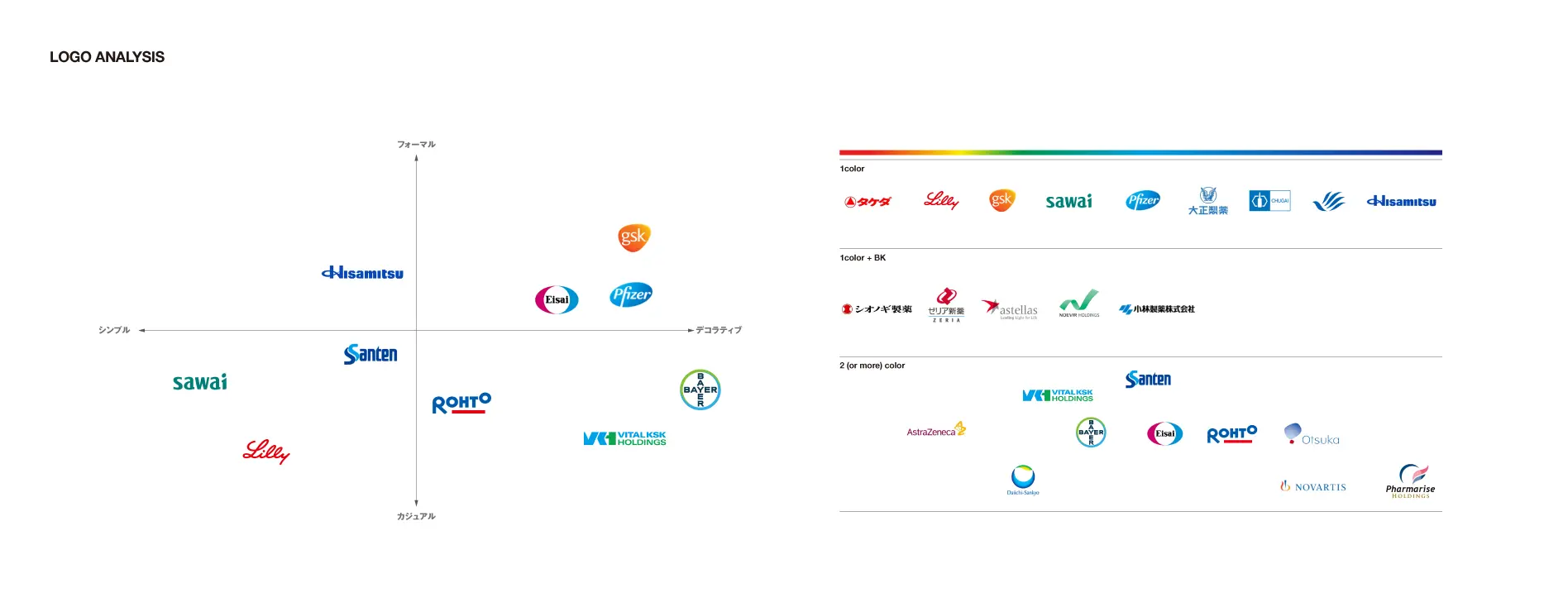
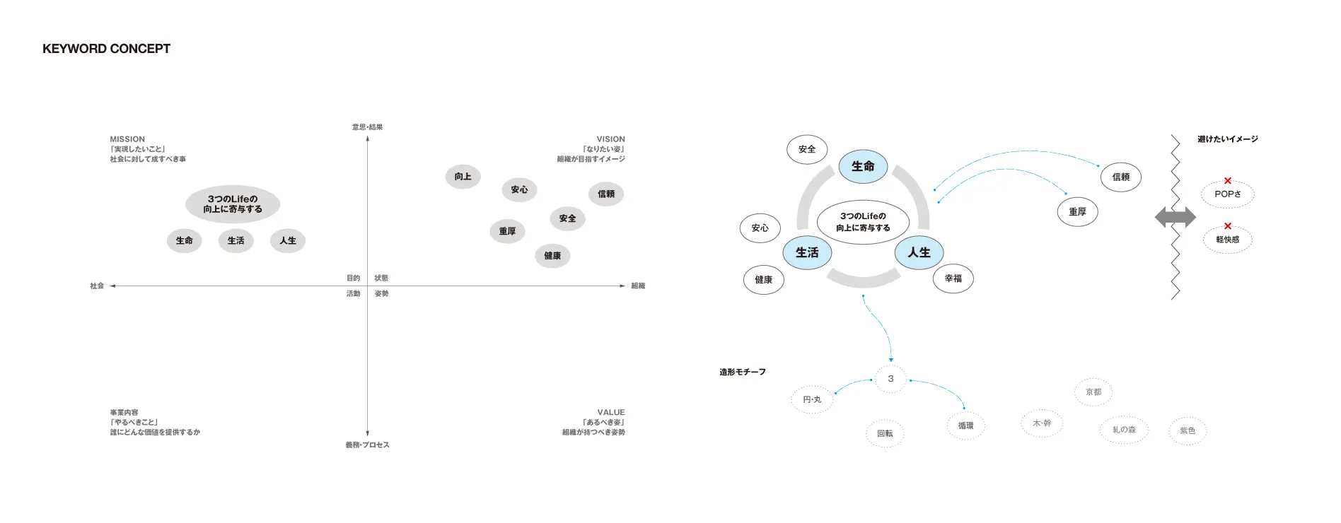
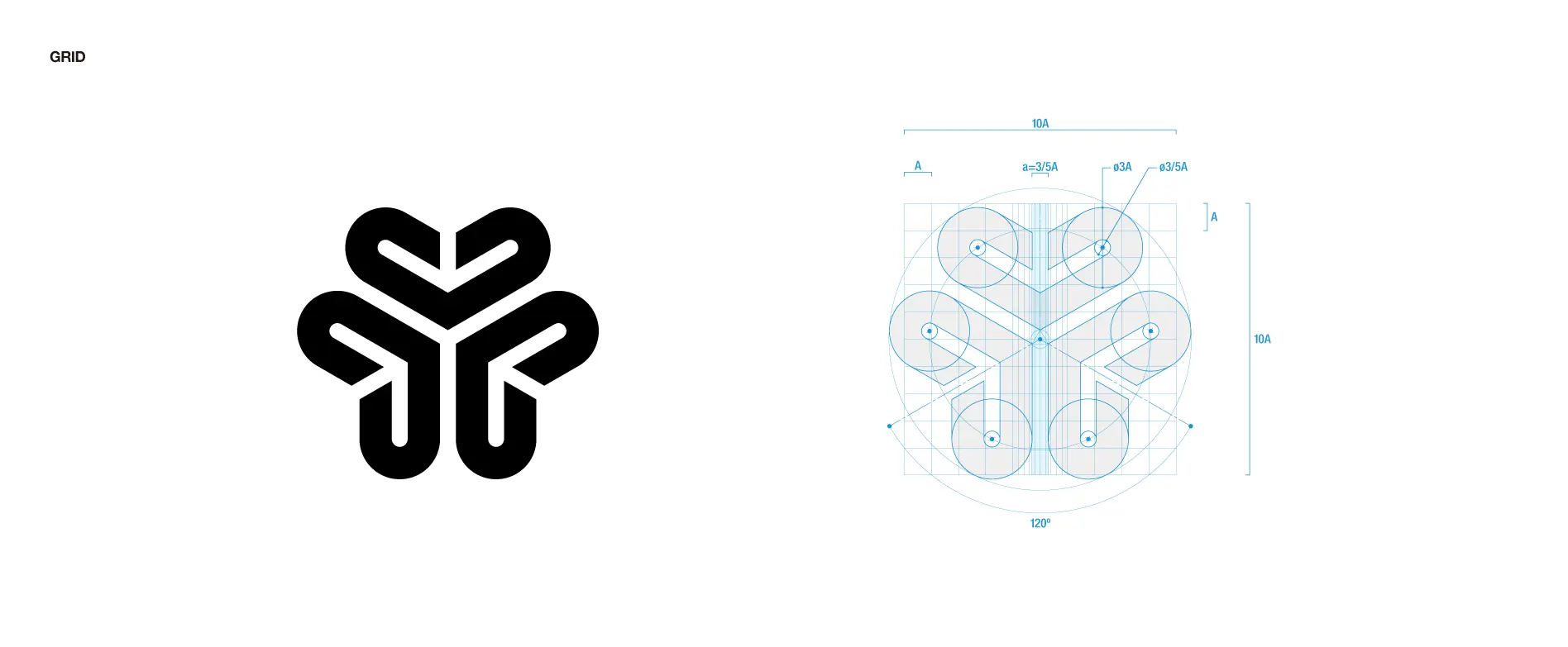
医療、製薬会社のロゴタイプの分析から、LDI独自のポジションを探索し、10以上の数のデザイン案から絞り込みを行いました。社名にも使われている「LIFE」には、生命、生活、人生という3つの意味が込められており、その意図を体現したデザインにまとめています。
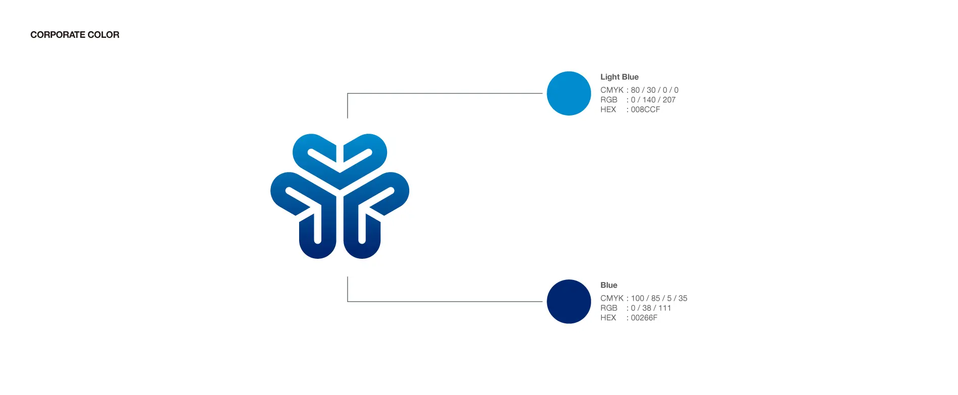
この3つの「Life」をハートのモチーフで表現し、シンプルな造形で抽象化し、同じモチーフを回転させ統合されたシンボルとしてまとめています。 各モチーフの中心に白いラインを追加することで、ブルーのラインは「ハート」白い部分は「矢印」という2重の意味を付与することで、 人々の「生命・生活・人生」を向上させる、という上向きの方向性を想起させる表現をデザインしています。
From an analysis of medical and pharmaceutical logotypes, LDI searched for a unique position and selected from more than a 10 design proposals.
The word “LIFE,” which is also used in the company’s name, has three meanings: LIFE, Living, and Biosis, and the design embodies these meanings.
The three “Life” motifs are represented by a heart motif, abstracted by a simple form, and the same motif is rotated and integrated into a unified symbol.
By adding a white line at the center of each motif, the blue line is a heart and the white part is an arrow, giving it a double meaning, evoking the upward direction of improving people’s “3 LIFE”.