SACO 2017
SACO
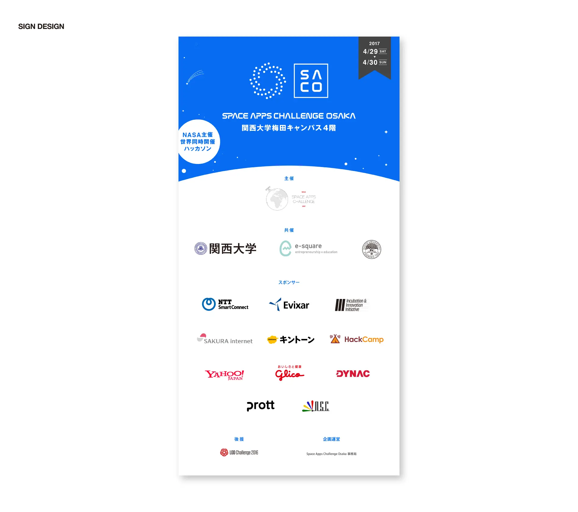
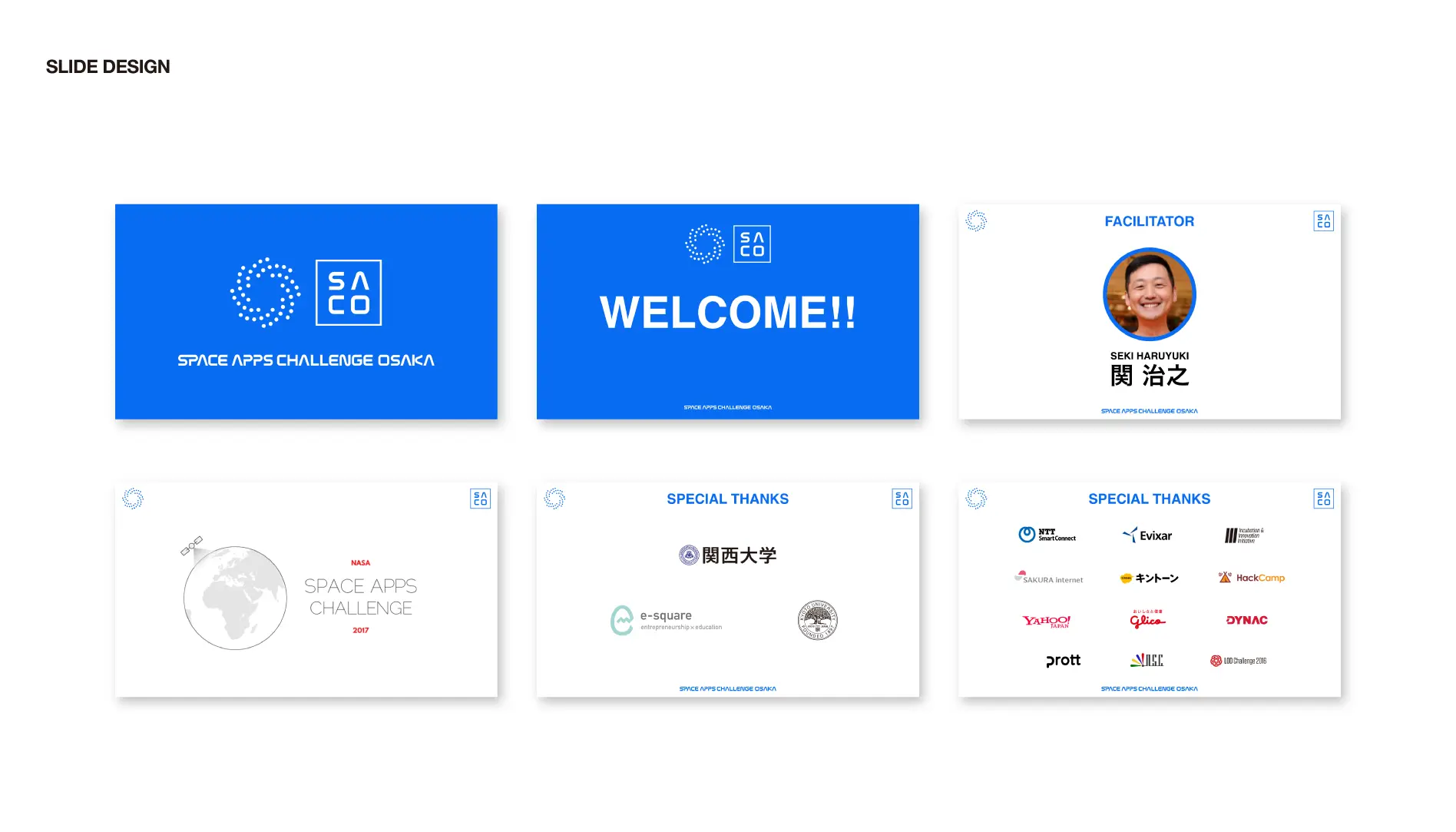
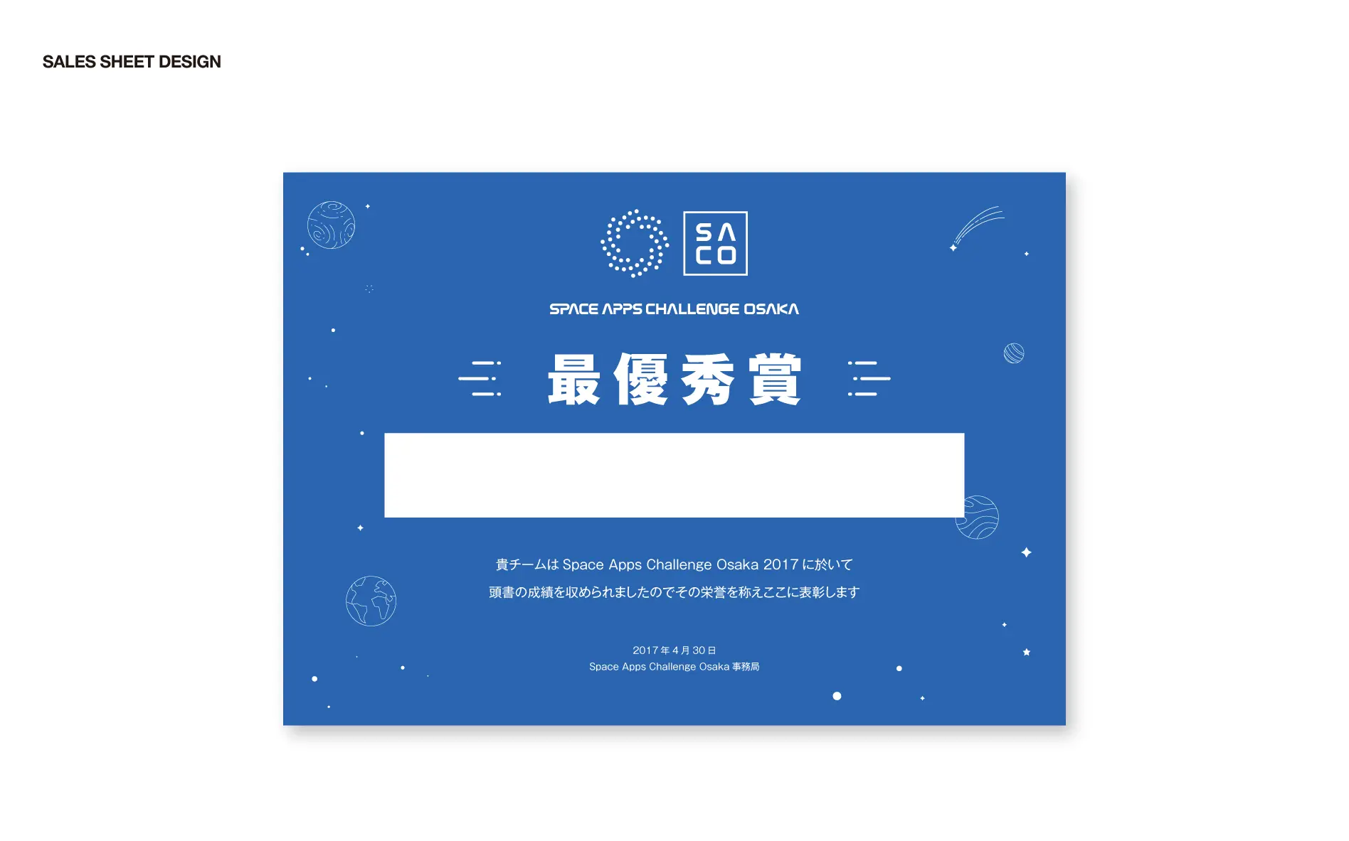
Space Apps Challenge Osaka 2017
Branding, Conference design, Art direction, Graphic, Sign design
Art Director: Shimizu Ryo
Cl: Space Apps Challenge Osaka Secretariat
Space Apps Challenge Osakaとは
Space Apps Challengeとは、NASA(米国航空宇宙局)によるインキュベーターイノベーションプログラム。2016年には世界160都市以上で同時開催された、世界最大規模のハッカソンです。NASAの保有するオープンデータも活用でき、各都市の上位2作品は、Global AwardにエントリーすることでNASAによる審査が受けられます。
2017年、関西にて初開催された本プログラム、Space Apps Challenge Osaka(SACO)のイベント全体のアートディレクションを手がけました。
About Space Apps Challenge Osaka
Space Apps Challenge is an incubator innovation program by NASA (National Aeronautics and Space Administration). It is the world’s largest Hackathon held in more than 160 cities worldwide in 2016. The open data possessed by NASA can also be utilized, and the top two works in each city can be reviewed by NASA by entry in the Global Award.
In 2017, Balloon Inc. involved in the event direction of the entire event of Space Apps Challenge Osaka (SACO), the first program in Kansai.
大阪らしさとNASAらしさ
NASAの名前を冠したイベントを、どのように演出し、デザインするか。ます最初に想起したのは、かつてのNASAのロゴタイプデザインでした。
1974年に発表されたNASAのロゴタイプは、シンプルでありながら力強く、とても美しいデザインです。アメリカで 「US federal design Improvement program」 というデザイン政策が国を挙げて実施されていた1970年代、NASAのブランド戦略の一環で策定されたこのロゴは「ワーム」と呼ばれ、その卓越したデザインで1984年には大統領デザイン賞にも輝いています。
その後1992年には(1959年から使われていたものの、一度引退した)「ミートボール」のロゴが復活し、この「ワーム」デザインのロゴタイプは姿を消します。現在は使われていませんが、NASAらしく強い印象を持つこの「ワーム」のロゴタイプを、今回のプロジェクトでは踏襲することを考えました。正統性を表現しつつ、大阪で初開催するという新規性を併せて訴求することを目指しています。
OSAKA’s identity and NASA’s identity
How to direct and design the event bearing the name of NASA. The first thing I recalled was the past NASA logo type design.
NASA’s logo type announced in 1974 is simple but powerful, very beautiful design. In the United States in the 1970’s, when the design policy “US federal design Improvement program” was implemented in the country, this logo was formulated as part of NASA’s brand strategy called “worm”, with its outstanding design 1984 It also shines as presidential design award in the year.
After that, in 1992 (although it was used since 1959, once retired) the “Meatball” logo revives, this logo type of “worm” design disappears.Although it is not currently used, I thought that following this project we will follow the logo type of this “worm” that has a strong impression like NASA. While expressing legitimacy, we aim to appeal together the novelty of holding in Osaka for the first time.
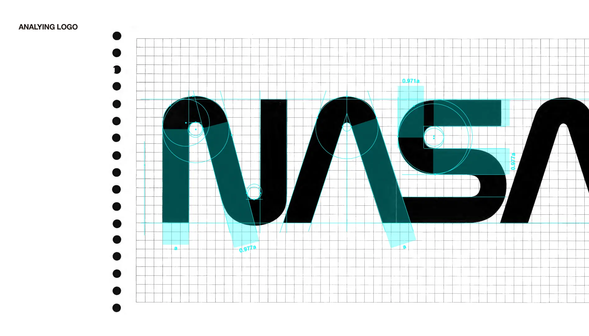
NASAフォントを手作業で蘇らせる
まず、1976年に発行されたNASAの「Graphic Stadards Manual」を参考に、NASAのロゴマークで使われているNASAの文字の構造を分析します。グリッドに配置されたロゴタイプの縦横のウェイト比や外内角R、文字間のスペースなどを詳細に観察することで、できるだけNASAらしく感じる要素の抽出を行いました。このプロセスによって、アルファベット全文字へ拡張した場合のエレメントとルールを設計し、そのルールに基づいてN・S・A以外の文字へと展開していきました。
Revive NASA font manually
First, with reference to NASA’s “Graphic Stadards Manual” issued in 1976, we will analyze the structure of the characters of NASA used in NASA’s logo mark. By observing in detail the vertical and horizontal weight ratios of the logotype placed on the grid, the external interior angle R, the space between letters, etc., we extracted elements that seem to be as NASA as possible. Through this process, we designed elements and rules when extending to all letters of the alphabet, and expanded to characters other than N · S · A based on the rules.
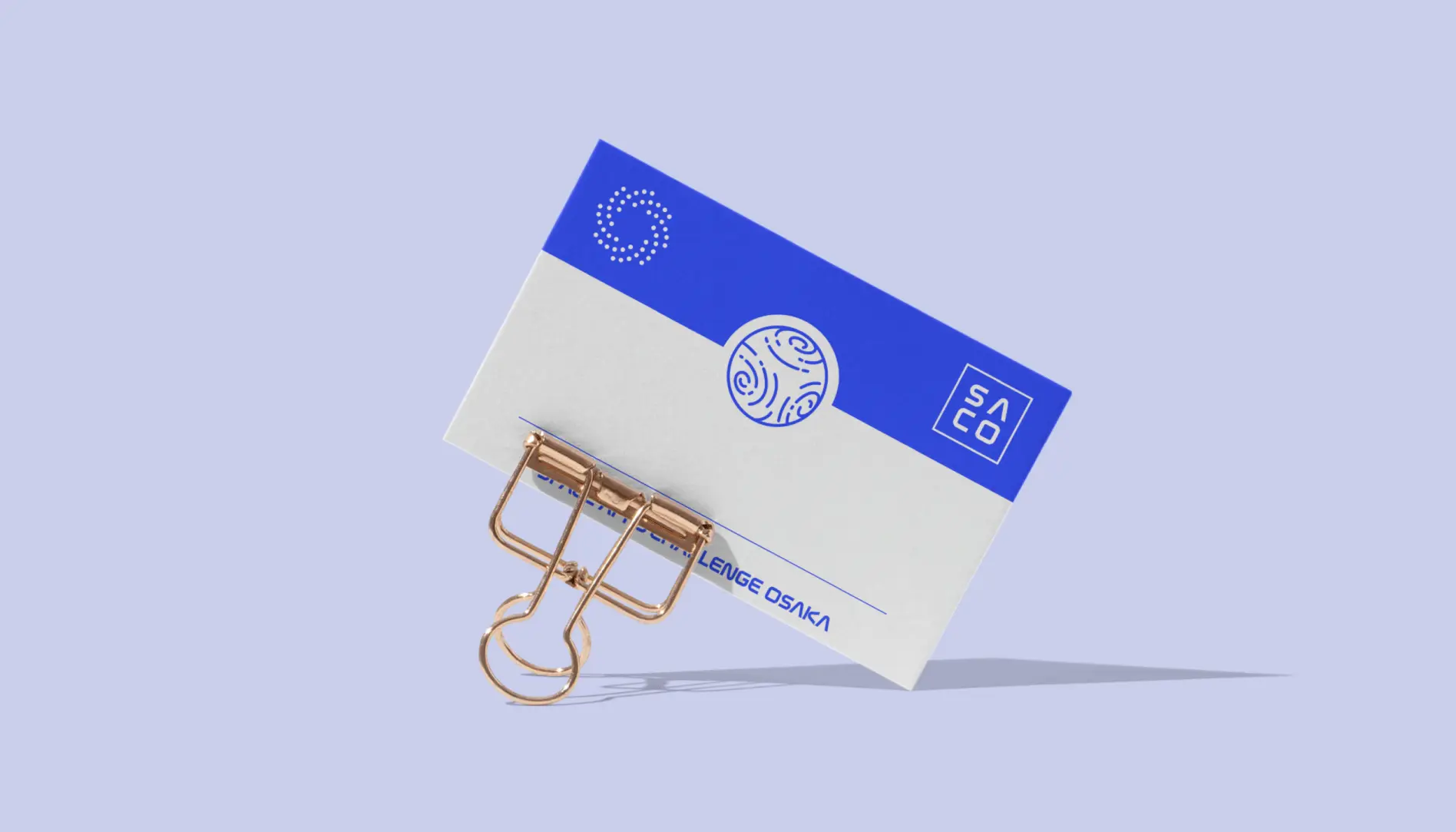
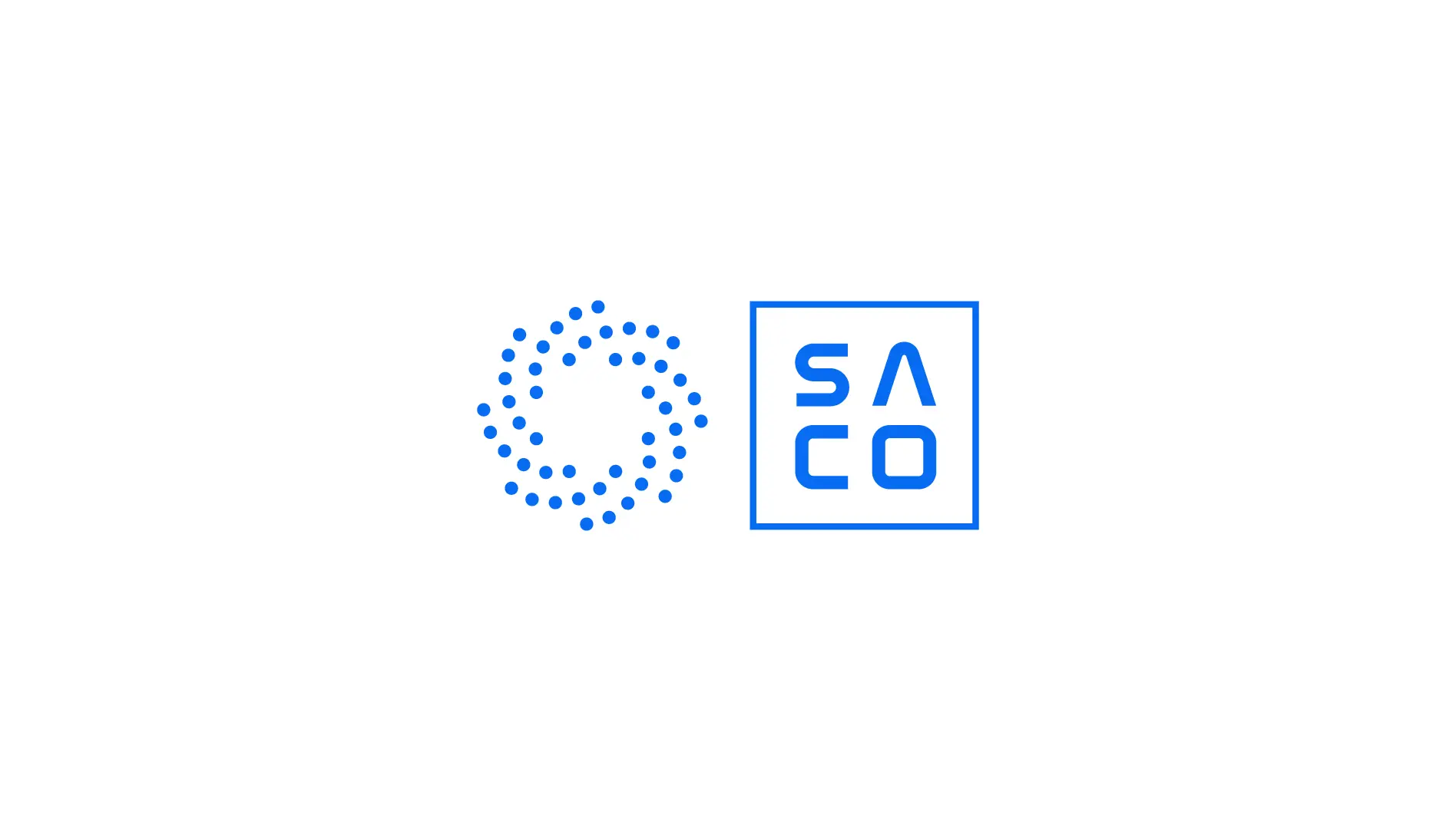
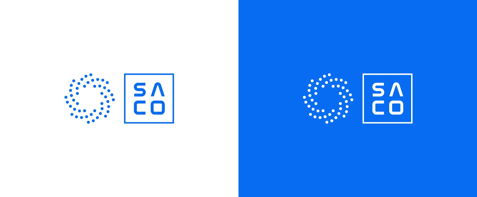
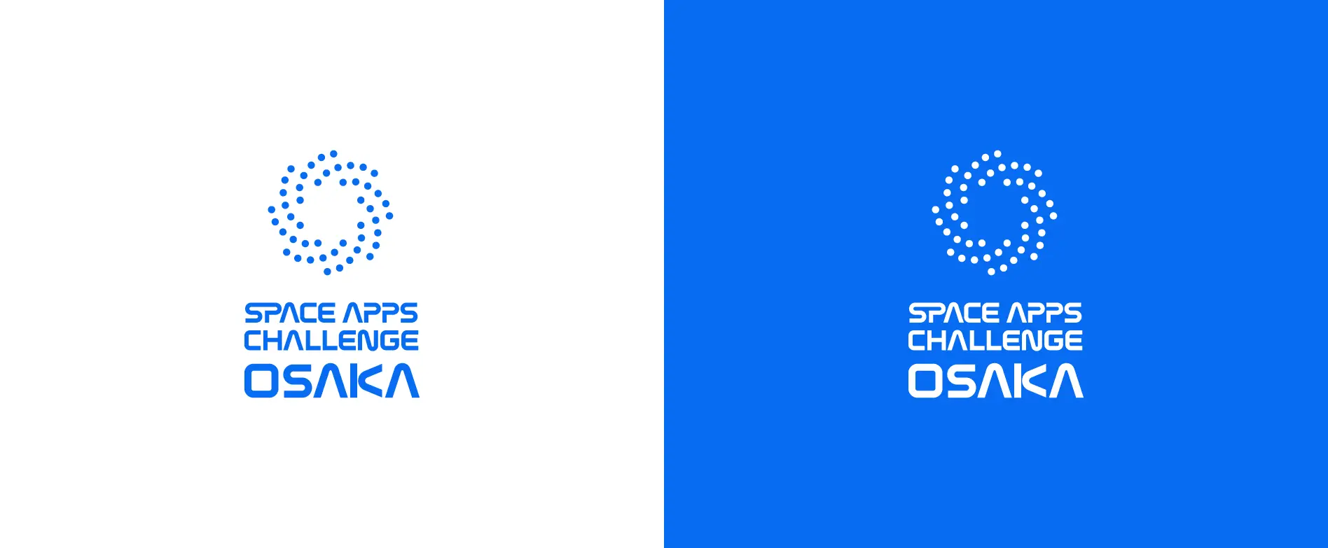
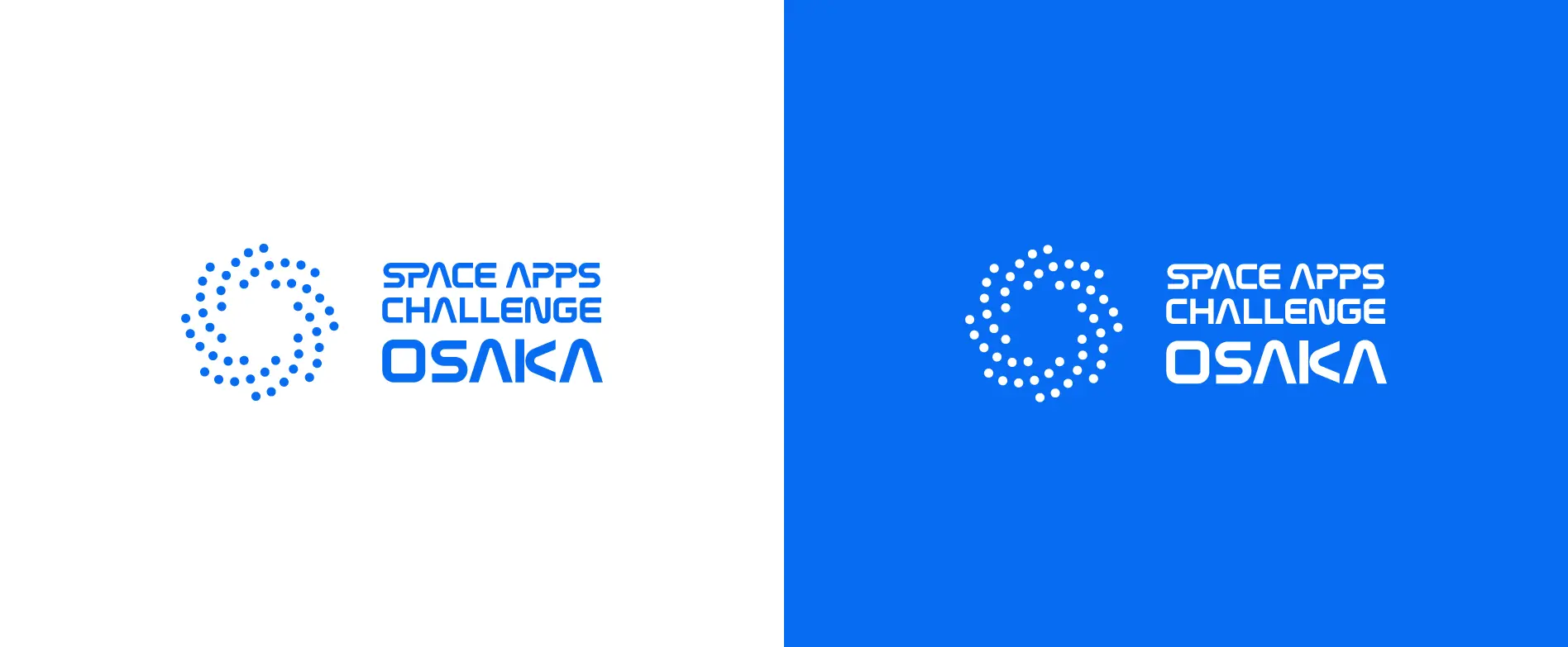
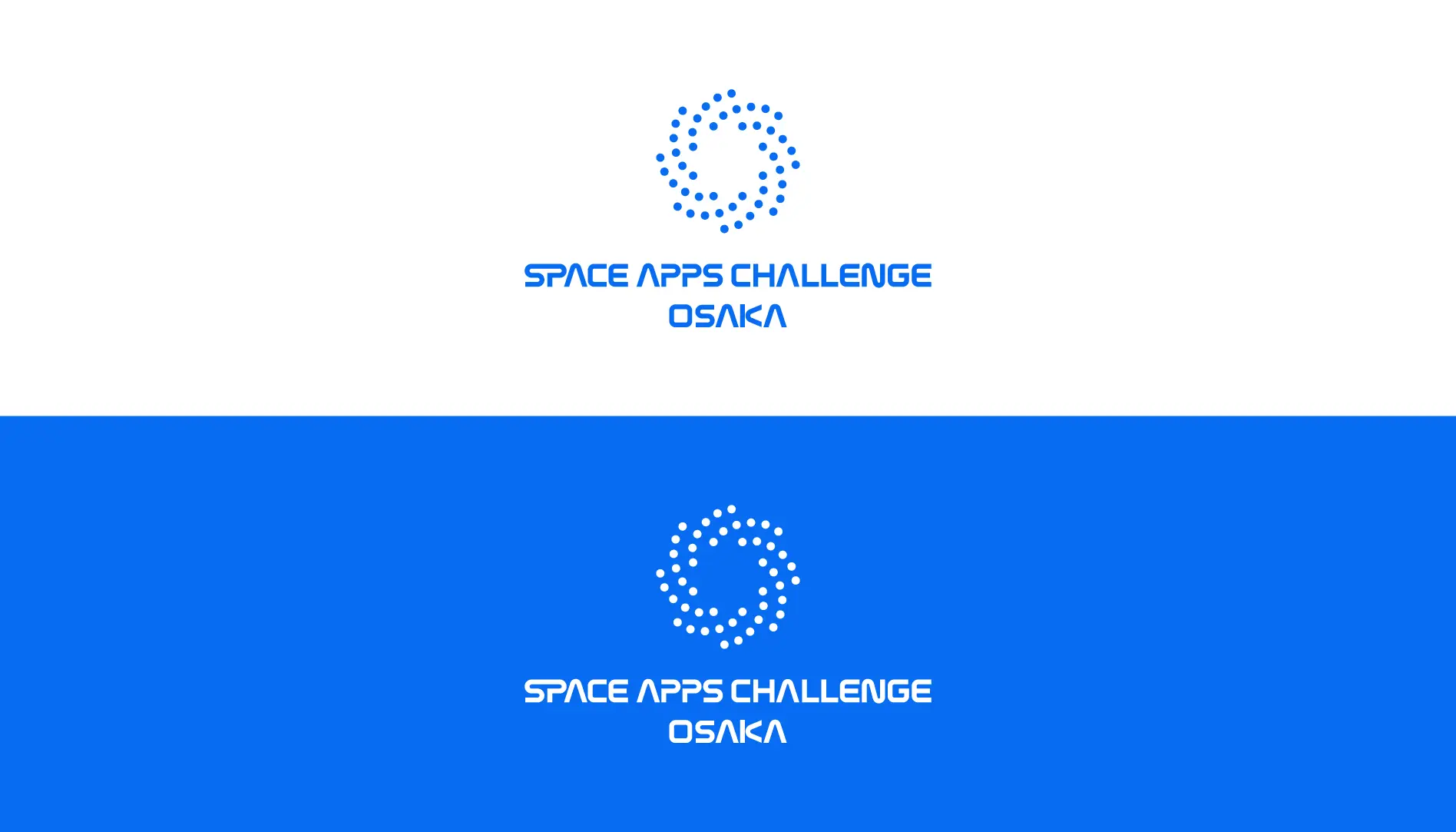
シンボルマークのイメージ
シンボルマークは、NASAロゴタイプのイメージと整合しつつ、他のイベントには無い新規性や、大阪での開催であることを考慮しました。
SACOは『大阪を「宇宙」というキーワードでフレーミングし、点在するFabを線でつなげたい。これまでのハッカソンではつながり得なかった、人と人との化学反応を起こして大阪をリブートしたい。』という想いのもとで運営されています。
この想いをもとに、点在するFab、そして夜空に浮かぶ星を表すドットを用いてシンボルマークを制作しました。放射状に広がるシャワーのようなデザインは、ゆっくりと拡張していく宇宙をイメージしています。
色合いは、宇宙を連想させるような青色をメインカラーとし、色調は明るく鮮やかなものを選びました。
An image of symbol mark
This symbol mark, consistent with the image of the NASA logo type, considered newness not present in other events and that it is held in Osaka.
SACO wants to”framing Osaka with the keyword “universe” and connect the scattered Fab with a line. We want to reboot Osaka by causing a chemical reaction between humans and people that could not be connected in Hackathon until now.” It is being operated under this principle.
Based on this principle, we have created symbol marks using dotted Fab and dots representing stars floating in the night sky. The design like a shower that extends radially imagines the universe that slowly expands.
About color, blue color which reminded of the universe was taken as the main color, and color tone was chosen brightly and vividly.